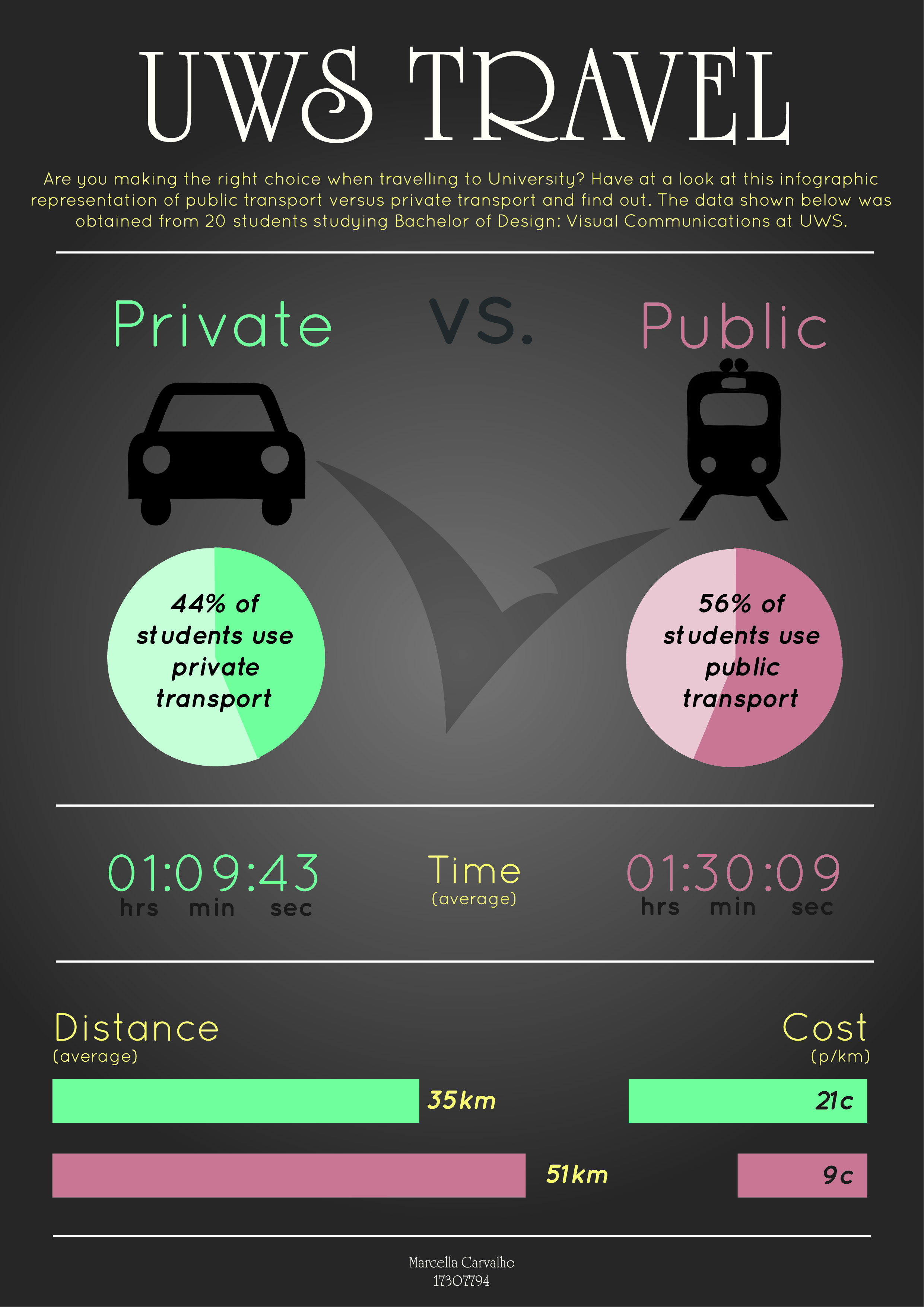
This infographic was created to communicate the differences between traveling to University by public transport and by private transport and to help students see that there isn’t only one way to get to uni. The target audience was students who go to UWS. The aim was to visualise the entire dataset, designing an information visualisation that would be useful for students to use, which shows the relative differences between using different modes of transport to and from UWS. The aspects of the data that I will be comparing will be time, distance and cost.